< style> : root { --blue: #00569 6; --blue-2: #00 4F9F; --blue- dark: #003a66; -- blue-deep: #002a4a; --blue-light: #e8 f1f8; --orange: #EA6100; --orange- 2: #F37021; --orange-dark: #c95300 ; --dark: #2B 2D33; --dark -2: #22242A; --white: #FFFFFF; --light: #F8F9FA; --text: #1C1E21; --text-soft: #4a4f57; --text-light: #CF D4DC; --radius: 4px; --shadow: 0 4px 12px rgba(0, 0, 0, .06); --shadow-hover: 0 10px 26px rgba(0, 0 , 0, .12); --font-head: 'Montserrat', Arial, Helvetica, sans-serif; --font-body: 'Open Sans', Arial, Helvetica, sans-serif; --header-h: 76px; } *, *::before, *::after { box-sizing: border-box; } html { scroll-behavior: smooth; } body { margin: 0; font-family: var(--font-body); font-size: 16px; line-height: 1.6; color: var (--text); background: var(--white); -webkit-font-smoothing: antialiased; } img, video { max- width: 100%; display: block; } a { color: inherit; text-decoration: none; } h1, h2, h3, h4 { font-family: var(--font-head); letter-spacing: -.01em; line-height: 1.2; margin: 0; } p { margin: 0; } ul { margin: 0; padding: 0; list-style: none; } button { font: inherit; cursor: pointer; } .container { width: 100%; max-width: 1280px; /* Adjusted for desired layout */ margin: 0 auto; padding: 0 24px; } .sr-only { position: absolute; width: 1px; height: 1px; overflow: hidden; clip: rect(0 0 0 0); white-space: nowrap; } /* Buttons */ .btn { display: inline-flex; align -items: center; justify-content: center; gap: 8px; padding: 13px 26px; border-radius: var(--radius); font-family: var(--font-head); font-weight: 700; font -size: 15px; letter-spacing: .02em; border: 2px solid transparent; transition: background .25s, color .25s, border-color .25s, transform .25s; white-space: nowrap; } .btn svg { width: 16px; height: 16px; flex-shrink: 0; } .btn-primary { background: var(--orange); color: var(--white); } .btn-primary:hover { background: var(--orange-dark); } .btn-outline { background: transparent; color: var(--white); border-color: var(--white); } .btn-outline:hover { background: rgba(255, 255, 2 55, .12); } .btn-outline-orange { background: transparent; color: var(--orange); border -color: var(--orange); } .btn-outline-orange:hover { background: var(--orange); color: var(--white); } /* Section heading */ .section { padding: 96px 0; } .section-head { max-width : 780px; margin-bottom: 52px; } .section-head.center { margin-left: auto; margin-right: auto; text-align: center; } .eyebrow { display: inline-flex; align-items: center; gap: 10px; font-family: var(--font-head); font-weight: 7 00; font-size: 13px; letter-spacing: .14em; text-transform: uppercase; color : var(--orange); margin-bottom: 14px; } .eyebrow::before { content: ""; width: 32px; height: 3px; background: var(--orange); border-radius: 2px; } . section-head.center .eyebrow::after { content: ""; width: 32px; height: 3px; background: var(--orange); border-radius: 2px; } .section-title { font-size: clamp(26 px, 3.2vw, 40px); font-weight: 800; color: var(--text); } .section-lead { margin-top: 16px; color: var(--text-soft); font-size: 17 px; } .on-dark .section-title, .on-dark h2, .on-dark h3 { color: var(--white); } .on-dark .section-lead, .on-dark p { color: var(--text-light); } /* ========== Hero ========== */ .hero { position: relative; height: 300px; /* Banner height */ min-height : 300px; max-height: 960px; overflow: hidden; background: var(--dark- 2); /* margin-top: var(--header-h); Removed to avoid pushing content down */ display: flex; align -items: center; justify-content: center; } .hero-slide { position: absolute; inset: 0; opacity: 0; visibility: hidden; transition: opacity 1s ease, visibility 1s; display : flex; align-items: center; justify-content: center; } .hero-slide.active { opacity: 1; visibility: visible; z-index: 1; } .hero-media { position: absolute; inset: 0; width: 100%; height: 100%; object-fit: cover; transform: scale(1.0 6); transition: transform 7s ease; } .hero-slide.active .hero-media { transform: scale(1); } .hero-slide::after { content: ""; position: absolute; inset: 0; background: linear-gradient(90deg , rgba(20, 24, 30, .88) 0%, rgba(20, 24, 30 , .6) 45%, rgba(20, 24, 30, .15) 100%), radial-gradient(ellipse at center, transparent 50%, rgba(0, 0, 0, .45) 100%); } .hero- content { position: relative; z-index: 2; width: 100%; text-align: center ; /* Center text content */ padding: 24px; } .hero-inner { max-width: 640 px; margin: 0 auto; display: inline-block; /* Allow centering */ } .hero-tag { display : inline-block; background: var(--orange); color: var(--white); font-family: var(--font-head); font -weight: 700; font-size: 12px; letter-spacing: .14em; text-transform: uppercase; padding: 6px 12px; border-radius: 2px; margin-bottom: 22px; } .hero-title { font-family: var(--font-head); font-weight: 800; font-size: clamp(34px, 5.4vw, 64px); line-height: 1.08; color: var (--white); letter-spacing: -.02em; } .hero-sub { margin-top: 20px; font-size: clamp(16px, 1.6vw, 19px); color: var(--text-light); max- width: 520px; margin-left: auto; margin-right: auto; } .hero-actions { margin-top: 34px; display: flex; flex-wrap: wrap; gap: 14px; justify -content: center; /* Center buttons */ } .hero-slide .hero-inner>* { opacity: 0; transform: translateY( 24px); transition: opacity .7s, transform .7s; } .hero-slide.active .hero-inner>* { opacity: 1; transform: none; } .hero-slide.active .hero-inner>*:nth-child(2) { transition-delay: .12s; } .hero-slide.active .hero-inner>*:nth-child(3) { transition -delay: .24s; } .hero-slide.active .hero-inner>*:nth-child(4) { transition-delay: .36s; } /* Products Section */ .section.products { padding: 96px 0; background: var(--white ); } .product-grid { display: grid; grid-template-columns: repeat(auto-fit, minmax(3 00px, 1fr)); /* Responsive grid */ gap: 32px; } .product-card { display: flex; flex-direction: column; background: var(--white); border-radius: var(--radius); box-shadow: var(--shadow); overflow: hidden; border: 1px solid #eef1f4; transition: transform .3s, box-shadow .3 s; height: 100%; /* Ensure cards have equal height */ } .product-card:hover { transform: translateY (-6px); box-shadow: var(--shadow-hover); } .product-figure { position: relative; aspect-ratio: 16/9; overflow: hidden; margin: 0; background: #dfe5ea; } .product-figure img { width: 100%; height: 100%; object-fit: cover; transition: transform .6s; } .product-card:hover .product-figure img { transform: scale(1.06); } .product-body { position: relative; padding: 44px 30px 30px; flex: 1; display: flex; flex-direction: column; } .icon-circle { position: absolute; top: -34px; left: 3 0px; width: 68px; height: 68px; border-radius: 50%; background: var(--white); border: 2px solid #b9d4ea; display: flex; align-items: center; justify-content: center; color: var(--blue); box-shadow: var(--shadow); transition: border-color .3 s, background .3s; } .icon-circle svg { width: 30px; height: 30px ; } .product-card:hover .icon-circle { border-color: var(--orange); } .product-body h3 { font-size: 22px; font-weight: 700; color: var(--text); } .product- body p { margin-top: 10px; color: var(--text-soft); } .check-list { margin- top: 16px; display: grid; gap: 8px; } .check-list li { display: flex; gap: 10px; font-size: 14.5px; color: var(--text-soft); align -items: flex-start; /* Align icon and text properly */ } .check-list li svg { width: 18px; height: 18px; flex-shrink: 0; color: var(--blue); margin-top: 3px; } .card-more { margin-top: auto; padding-top: 22px; display: inline-flex; align-items: center; gap: 8px; font-family: var(--font-head); font-weight: 700 ; font-size: 14px; color: var(--orange); transition: transform .25s; } .product -card:hover .card-more { transform: translateX(5px); } .product-links { margin-top: 40 px; display: flex; flex-wrap: wrap; gap: 14px; justify-content: center; } /* About Section - Replaces original company info for better flow */ .about-section { padding: 96px 0; background: var(--light); } .about-grid { display: grid; grid-template-columns: repeat(auto-fit, min max(300px, 1fr)); gap: 48px; align-items: center; } .about-text h 2 { font-size: clamp(30px, 3.2vw, 48px); font-weight: 80 0; color: var(--text); } .about-text p { margin-top: 20px; color : var(--text-soft); font-size: 17px; line-height: 1.7; } .about -text .highlight { color: var(--orange); font-weight: 700; } .about-features { margin -top: 30px; display: grid; gap: 18px; } .feature-item { display: flex ; gap: 16px; align-items: flex-start; } .feature-item .icon-wrapper { width: 56px; height: 56px; border-radius: 50%; background: rgba(0, 8 6, 150, 0.08); color: var(--blue); display: flex; align-items: center; justify-content: center; flex-shrink: 0; } .feature-item .icon-wrapper svg { width: 24px; height: 24px; } .feature-item-content strong { display: block; font -family: var(--font-head); font-size: 18px; font-weight: 700; margin -bottom: 6px; } .feature-item-content span { font-size: 15px; color: var(-- text-soft); } .about-visual { position: relative; border-radius: var(--radius); overflow: hidden ; box-shadow: var(--shadow-hover); aspect-ratio: 4/3; } .about-visual img { width: 100%; height: 100%; object-fit: cover; } /* Future Trends Section */ .trends -section { padding: 96px 0; background: var(--dark); color: var(--white); } .trends-grid { display: grid; grid-template-columns: repeat(auto-fit, minmax(300px, 1fr )); gap: 48px; align-items: center; } .trends-text h2 { font-size: clamp (30px, 3.2vw, 48px); font-weight: 800; } .trends- text p { margin-top: 20px; color: var(--text-light); font-size: 17 px; line-height: 1.7; } .trend-icon { display: inline-flex; align -items: center; justify-content: center; width: 48px; height: 48px; border-radius: 50%; background: var(--orange-2); margin-bottom: 16px; } . trend-icon svg { width: 24px; height: 24px; color: var(--white); } .trend -item h3 { font-size: 22px; font-weight: 700; color: var(--white ); margin-bottom: 10px; } .trend-item p { font-size: 15px; color: var(--text-light); line-height: 1.6; } .trends-visual { position: relative ; border-radius: var(--radius); overflow: hidden; box-shadow: 0 18px 40px rgba(0, 0, 0, .35); aspect-ratio: 4/3; } .trends-visual img { width: 100%; height: 100%; object-fit: cover; filter: brightness( 0.7); /* Slightly dim image for visual contrast */ } /* FAQ Section */ .section.faq { padding: 96px 0; background: var(--light); } .faq-grid { display: grid; grid-template-columns: repeat(auto- fit, minmax(300px, 1fr)); gap: 56px; align-items: start; } .faq -list { display: grid; gap: 12px; } .faq-item { background: var(--white ); border-radius: var(--radius); box-shadow: var(--shadow); border-left: 3px solid transparent ; transition: border-color .25s; } .faq-item[open] { border-left-color: var(--orange); } .faq-item summary { list-style: none; display: flex; align-items: center; justify -content: space-between; gap: 18px; padding: 20px 22px; cursor: pointer; font-family: var(--font-head); font-weight: 700; font-size: 16px; color : var(--text); } .faq-item summary::-webkit-details-marker { display: none; } .faq- item summary svg { width: 18px; height: 18px; flex-shrink: 0; color: var (--blue); transition: transform .3s; } .faq-item[open] summary svg { transform: rotate(45deg); color: var(--orange); } .faq-answer { padding: 0 22px 22px; color: var (--text-soft); } /* Company Strengths Section */ .strengths-section { padding: 96px 0; background : var(--white); } .strengths-grid { display: grid; grid-template-columns: repeat(auto-fit, minmax( 280px, 1fr)); gap: 32px; text-align: center; } .strength-card { background : var(--white); border-radius: var(--radius); box-shadow: var(--shadow); padding: 40px 2 4px 32px; transition: transform .3s, box-shadow .3s; } .strength-card:hover { transform: translateY(-6px); box-shadow: var(--shadow-hover); } .strength-card .icon-wrapper { width : 72px; height: 72px; border-radius: 50%; background: var(--blue- light); color: var(--blue); display: flex; align-items: center; justify-content: center; margin : 0 auto 24px; position: relative; } .strength-card .icon-wrapper::after { content : ""; position: absolute; inset: -4px; border-radius: 50%; border: 2 px dashed rgba(0, 86, 150, 0.4); animation: spin 8s linear infinite; } @keyframes spin { to { transform: rotate(360deg); } } .strength-card .icon -wrapper svg { width: 32px; height: 32px; } .strength-card h3 { font -size: 24px; font-weight: 700; color: var(--text); margin-bottom: 12 px; } .strength-card p { font-size: 15px; color: var(--text-soft); line-height: 1.6; } /* Call to Action Button */ .cta-button-container { text-align: center; padding: 60px 0; } .cta-button-container .btn-primary { font-size: 18 px; padding: 16px 36px; } /* Interactive Elements */ .aicc_product_card:hover . aicc_icon_box { transform: scale(1.1); background-color: var(--orange-2); color : var(--white); } .aicc_stats_counter { font-family: var(--font-head); font-weight: 80 0; font-size: 3em; color: var(--orange); margin-bottom: 10px; } .aicc_highlight_text { color: var(--blue); font-weight: 700; } .aicc_gradient _border { border: 2px solid transparent; border-image-source: linear-gradient(to right, var(--orange), var(--blue )); border-image-slice: 1; padding: 10px; display: inline-block; } /* Responsive Adjust ments */ @media (max-width: 1280px) { .container { max-width: 118 0px; } } @media (max-width: 1024px) { .container { max -width: 960px; } .hero { height: 280px; min-height: 2 80px; } .hero-title { font-size: clamp(28px, 4.5vw, 5 0px); } .hero-sub { font-size: clamp(15px, 1.5vw, 1 7px); } .section { padding: 76px 0; } .product-grid { grid-template-columns: repeat(auto-fit, minmax(280px, 1fr)); } .about-grid , .trends-grid, .strengths-grid, .faq-grid { grid-template-columns: 1fr; } .about-visual, .trends-visual { margin-top: 30px; } } @media (max-width: 768px) { .container { max-width: 720px; } .hero { height: 250px; min-height: 250px; } .hero- title { font-size: clamp(24px, 4vw, 40px); } .hero-sub { font-size: clamp(14px, 1.4vw, 16px); } .section { padding: 6 4px 0; } .section-head { margin-bottom: 36px; } .product-card .icon-circle { top: -28px; left: 20px; width: 56px; height : 56px; } .product-body { padding: 38px 20px 24px; } .strength-card { padding: 30px 18px 24px; } .strength-card .icon -wrapper { width: 60px; height: 60px; margin-bottom: 18px; } } @media (max-width: 480px) { .container { max-width: 100%; padding : 0 15px; } .hero { height: 220px; min-height: 22 0px; } .hero-title { font-size: clamp(22px, 3.8vw, 32px); } .hero-actions { flex-direction: column; gap: 12px; } .btn { width: 100%; } .section { padding: 50px 0 ; } .section-head { margin-bottom: 24px; } .product-grid { gap : 24px; } .strength-card h3 { font-size: 20px; } .cta-button-container { padding: 40px 0; } }
Dynamic background image of robotic arms in a warehouse

Custom Heavy Duty Robotic Storage Racking Manufacturer & Exporter

Precision-engineered solutions for automated warehouses, optimizing space and efficiency with advanced robotic integration.

Explore Our Solutions

State -of-the-Art Heavy Duty Robotic Storage Racking Systems

Designed for the demands of modern automated warehouses , our racking solutions provide unparalleled strength, stability, and integration capabilities for robotic operations.

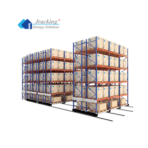
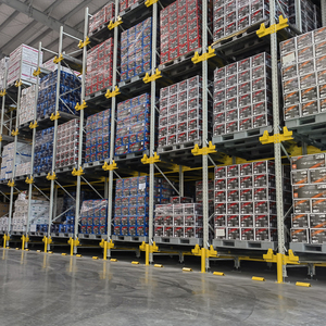
Automated Mobile Pallet Racking System

Automated Mobile Pallet Racking

High-density storage powered by electric mobile bases, ideal for robotic pallet handling and maximizing floor space utilization.

  • Robotic-compatible load surfaces
  • Precision-engineered for autonomous movement
  • Advanced safety features for robotic operations
View Details
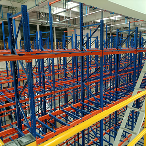
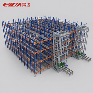
Intelligent Automated Warehouse Rack System

Intelligent Automated Warehouse Rack System

Designed for unmanned patrol and sorting, this multi-layer system offers corrosion protection and exceptional load-bearing capacity.

  • High automation level for robotic integration
  • Robust construction for 1000-4000kg loads
  • Corrosion protection for longevity
View Details
Custom Welded Steel Robot Pedestal Stand

Custom Welded Steel Robot Pedestal

OEM metal fabrication for industrial automation bases, designed precisely to your drawings for optimal robotic arm support.

  • Tailored to specific robotic payloads
  • High-strength welded steel construction
  • Precision manufacturing to client drawings
View Details
ASRS Cold Room Racking System

ASRS Cold Room Racking

Automatic Retrieval Storage and Retrieval (ASRS) system designed for cold rooms, ensuring efficient robotic operations in sub-zero environments.

  • Engineered for extreme temperature resilience
  • Optimized for automated pallet handling
  • High throughput and storage density
View Details
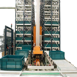
Automated Storage Retrieval Pallet Rack
< div class="product-body">

Automated Pallet Rack Systems

Revolutionize order picking with our automated systems that reduce labor and increase retrieval speed, powered by advanced ASRS technology.

  • Labor-saving automated picking
  • High storage density
  • Seamless integration with ASRS
View Details
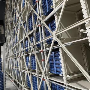
Customized High-Density ASRS Pallet R
acking System

High-Density ASRS Pallet Racking

Customized steel powder-coated ASRS systems designed for maximum density, perfect for smart automated storage solutions.

  • Optimized for maximum space utilization
  • Durable powder-coated steel finish
  • Seamless integration with automated systems
View Details
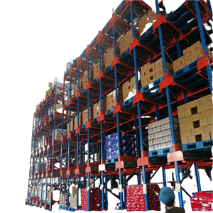
Automated Warehouse Pallet Shuttle Racking System

Automated Pallet Shuttle Racking

Intelligent heavy-load steel racking for multi-level automated warehouses, featuring anti-rust properties for maximum durability.

  • High-capacity pallet shuttle integration
  • Anti-rust treatment for extended lifespan
  • Multi-level design for optimal space usage
View Details
Automated Radio Shuttle Racking System

Automated Radio Shuttle Racking

Intelligent heavy-duty steel storage racks with smart control for automated radio shuttle systems, supporting loads up to 2500kg.

  • High load capacity (2500kg)
  • Smart controlled robotic operations
  • Engineered for automated warehouses
View Details
About Us Your Premier OEM Partner for Heavy Duty Robotic Storage Racking

As a leading Custom OEM Heavy Duty Robotic Storage Racking Manufacturer & Exporter, we specialize in designing and fabricating robust, high-performance storage solutions tailored for the rigorous demands of automated warehouse environments. Our extensive E-E-A-T commitment ensures you receive products built on experience, expertise, authority, and reliability.

Leveraging decades of industry insight, we engineer racking systems that integrate seamlessly with robotic arms, automated guided vehicles (AGVs), and automated storage and retrieval systems (ASRS). We provide unparalleled information gain to our clients, offering custom-engineered solutions that optimize space, enhance safety, and dramatically improve operational throughput.

< div class="about-features">
Custom OEM Fabrication Tailored designs to meet your exact robotic system specifications.
Robotic Integration Expertise Racking engineered for seamless compatibility with advanced automation.
Global Export Capabilities Reliable delivery and support worldwide for your international projects.
Warehouse automation with robotic arms and heavy duty racking
Frequently Asked Questions

Your Questions on Robotic Racking Solutions Answered

We understand that investing in heavy duty robotic storage racking is a significant decision. Here are answers to common questions from procurement and engineering teams.

What is the primary benefit of using heavy duty robotic storage racking?

The primary benefit is enhanced operational efficiency and throughput. Our heavy duty robotic storage racking is engineered for seamless integration with robotic systems, enabling higher storage density, faster retrieval times, and reduced human error. This translates to significant cost savings and improved supply chain performance.

How does your OEM service ensure the racking fits robotic requirements?

Our OEM process begins with a deep dive into your specific robotic application. We analyze the robotic arm's reach, payload, speed, and any unique operational parameters. This allows us to design and fabricate racking structures with precise dimensions, load capacities, and surface finishes to ensure optimal robotic interaction and longevity.

What materials and construction methods do you use for heavy duty racking ?

We primarily use high-strength steel alloys, often Q235 or Q345 grades, chosen for their exceptional load-bearing capabilities and durability. Construction involves precision welding and fabrication techniques, adhering to strict international standards. We also offer specialized anti-rust treatments and robust powder coatings to ensure resistance to corrosion and wear, even in demanding environments.

Can your racking systems support different types of robotic operations?

Absolutely. Our custom solutions are designed to accommodate various robotic applications, including Automated Storage and Retrieval Systems (ASRS), Autonomous Mobile Robots (AMRs), robotic pallet wrappers, and automated guided vehicles (AGVs). We engineer features such as smooth , flat surfaces for AGV navigation, precise bay dimensions for ASRS, and robust bases for robotic pedestal mounts.

What is the typical lead time for a custom OEM racking project?

Lead times vary based on project complexity, volume , and customization requirements. Typically, a custom OEM racking project can range from 6 to 12 weeks from design finalization to delivery. We provide detailed timelines during the quotation process and maintain transparent communication throughout production and export.
Our Competitive Edge

Why Partner with Us for Robotic Racking Solutions?

Unmatched Customization

Leveraging OEM capabilities, we deliver bespoke racking designs precisely engineered for your robotic systems and warehouse layout.

Proven Reliability

Our commitment to E- E-A-T ensures every product meets stringent quality control, guaranteeing long-term performance and safety.

Global Export Network

With extensive experience as an exporter, we manage international logistics efficiently, ensuring timely delivery to your global facilities.

Information Gain Advantage

We provide detailed technical insights and consultation, empowering you with the knowledge to make informed procurement decisions and optimize operations.

Get a Quote